Crop growth animations using ggplot and gganimate

Crop growth animations using ggplot and gganimate

m

March 22, 2019

For winter wheat crop modelling, I designed some animations in R. To make growth curves and bubble plots, I used some R packages such as “ggplot2” and “gganimate“. The code description of these animations is given on below mentioned Github links.

Bubble plots in R

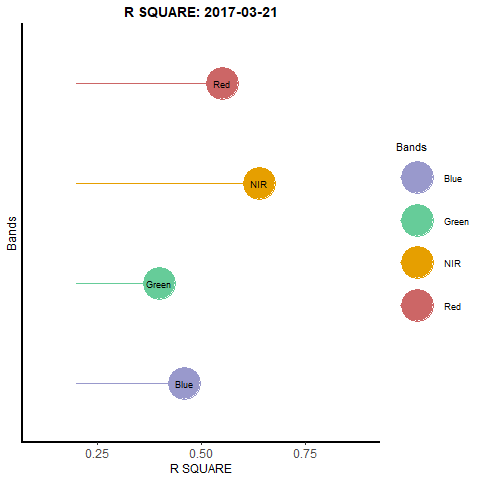
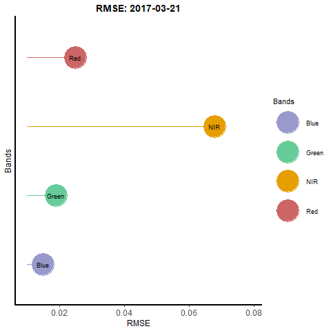
Bubble plots are an effective way of displaying data. For my study, I created these plots to describe the quality assessment of synthetic remote sensing data (combination of Landsat (30m) and Modis (500m)) used for generating daily time series of winter wheat. The code is described on my Github account.

Growth Curves in R

After producing quantitative data on the rate of development of the winter wheat crop, I produced the logistic curve of its biomass using lue and ggplot2 packages in R.

Model generated biomass curve of winter wheat using Light use efficiency model in 2015

In addition, I made use of the above mentioned packages to generate a comparative plot between actual and optimal growth rate of winter wheat. The code for this curve is provided on my GitHub account.

Comparison of optimal versus actual growth rate of winter wheat in DEMMIN, Germany

Maninder Singh Dhillon


you may also like:

High Arctic field work in Bjørndalen (Svalbard)

High Arctic field work in Bjørndalen (Svalbard)

Last week, EORC employees Jakob Schwalb-Willmann and Sebastian Buchelt travelled to Longyearbyen, Svalbard, for a two-week research and teaching stay on the high-arctic island. Invited by our collaborators and colleagues Assoc. Prof. Larissa Beumer...

Presentation at ESA Advanced Training Course

Presentation at ESA Advanced Training Course

At the 14th Advanced Training Course on Land Remote Sensing – Agriculture, held from 29 September to 3 October in Thessaloniki, researchers, early-career scientists, and experts from across Europe gathered to exchange knowledge on the latest advances in remote sensing...