
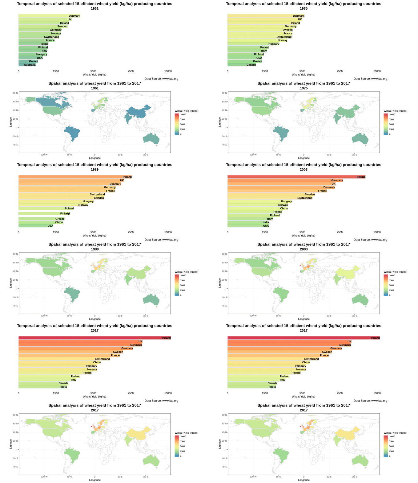

Bar Chart race using ‘gganimate’ for world’s most efficient wheat yield producing countries

Bar Chart race using ‘gganimate’ for world’s most efficient wheat yield producing countries

April 21, 2019

Easy spatio-temporal visualization of 15 selected efficient wheat yield producing countries using #gganimate in R. The below-mentioned bar chart race shows that Ireland leads the world in efficient wheat yields. Related to this, an article written by John Spink @teagasc says “Yields over a 10-year period are nearly 10% higher than the UK and well above those of New Zealand, which boasts the world wheat yield record.”

The respective code is given and explained on my Github account.
follow us and share it on:

you may also like:

The Programming Hero Syndrome

The Programming Hero Syndrome

The Quiet Ones and the Strange Career of “Experts” in Research After enough years teaching MSc and PhD students, running courses, sitting through conference talks, workshops, and the very scientific ritual of coffee breaks, some of us started noticing a type. Maybe...

MainPro remote sensing analysis products are now available online

MainPro remote sensing analysis products are now available online

Within our interdisciplinary research project MainPro, we aim to analyse potential climate change induced geohazards in the Main valley and its tributaries and develop nature-based solutions for them.  This project involves a large-scale analysis of potential...

Share This